What is an Information Architecture Diagram (IAD)
The IAD is one of the classic deliverables early in the software elaboration process. In the case of Paged Internet Applications (PIAs) this diagram is relatively simple to develop providing a clear map of all the screens within an application and how they are accessed through the menu system.
“In October 2000, Jesse James Garrett introduced a site architecture documentation standard called the Visual Vocabulary. Since then, it has become widely adopted among information architects and user experience professionals. The Visual Vocabulary is a simple set of shapes for documenting site architectures.” (http://www.jjg.net/ia/visvocab/)
The following is an example of a site map using the Visual Vocabulary.

The diagram reads from top to bottom, left to right. Ovals represent menu items horizontal rectangles represent screens. Objects made with broken lines are optional and normally have some associated text to explain the option logic eg Admin & Manager only.
What value do IADs bring?
The IAD provides a complete view of an entire application from an information architecture perspective.
IADs would enable the Composer user to:
Meet current deliverable expectationsThe IAD is regarded by many as part of the elaboration document for signoff. Currently it is not supported by Composer and thus leaves a hole in the traditional signoff document.
Provide a high level view from user experience perspectiveThe IAD is a great place to begin the review of an application from a user experience perspective. From this high level view stake holders can see the complete application in context.
Strategically place functionalityAs such the IAD shows the mapping of content/functionality to the menu system. Getting this mapping right is a fundamental building block to creating highly useable applications as experience has shown that users who arrive at an application with an externally prompted use case will look at the menu system to find the functionality to complete this use case.
For example, lets take this externally prompted use case scenario:
Step 1 - User gets a call from a potential customer
Step 2 - User enters system to add a new contact
In this scenario the user is more likely to look at the menu system first in order complete the use case than in the content area of the page. On selection of the most appropriate menu item the user will then look for a second level item to further focus on the required functionality. On exhausting menu possibilities the user will then begin to study the content area of the page for the functionality required to create a new contact.
This focus on the menu system for externally prompted use cases emphasizes the strategic importance of the menu system i.e. the information architecture as the basis for high usability.
Another interesting aspect of the value of IAD support in Composer would be the inclusion of the Information Architecture fraternity into the mix of users. Currently many Information Architects (IAs) do not see much value in specification and simulation tools. Composer provides no native support for IA related issues, leaving those with a focus on such issues out in the cold. The inclusion of native support for IADs should turn the heat up on this interest significantly.
Implication of IAD support for Composer
My vision of IAD support within Composer would result in the incorporation of two new steps in the composition flow (Info Architecture and Screen) and a new control to populate the Controls panel in the Interface step (Menu).
Info Architecture (new step)The development of the IAD comes right at the start of the elaboration process. As such it makes sense to introduce it early in the Composer process. However in this case I think it makes sense to include Info Architecture under the Activity step.
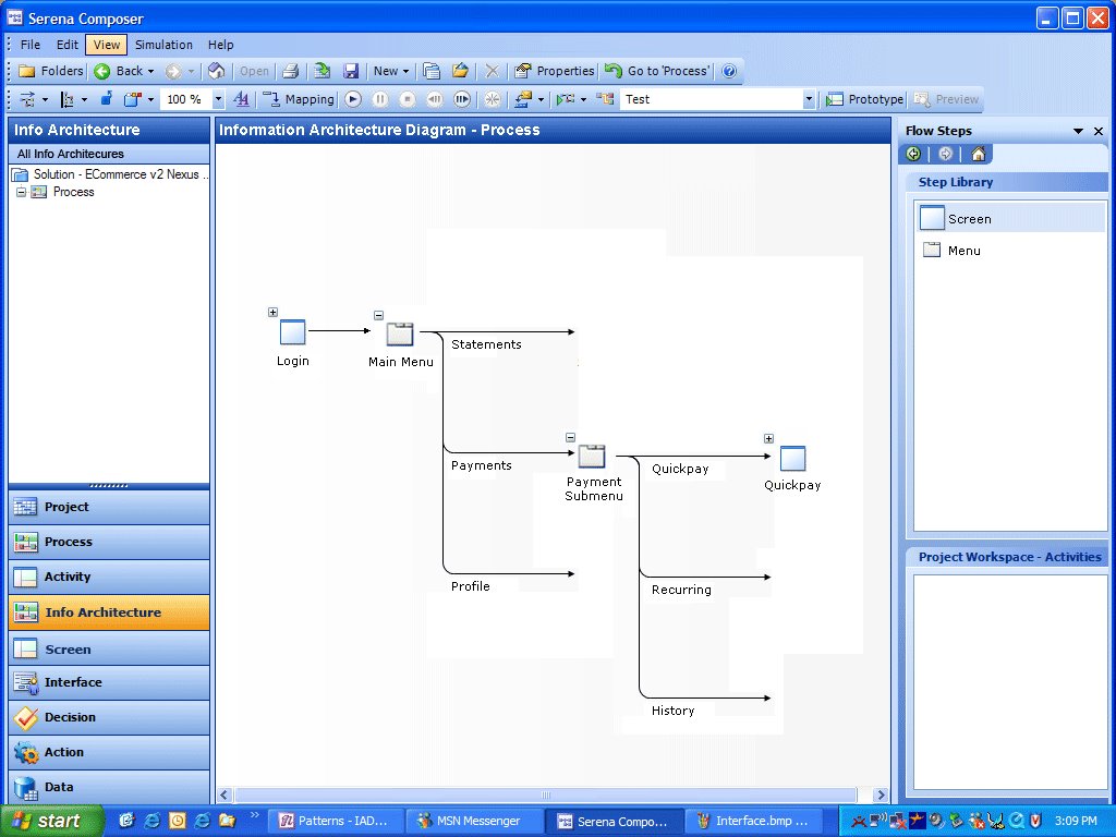
I envision that the Info Architecture step would enable users to drag and drop Jesse James's visual vocabulary objects onto the main pane, naming them and connecting them together to create a diagram in a similar manner to the Process and Activity steps just with different icons populating the Step Library pane.For example to create a IAD the user would do the following:
- Drag a screen icon from the Step Library
Right click on the screen icon to set its properties:
Name (Login)
Screen binding (Non-authenticated Content Screen)
Activity binding (Login Activity)
Requirement binding (Login Requirement) - Drag a menu item from the Step Library and place it under screen icon
Right click on menu item to set its properties:
Name (Main menu)
Manage menu items (add Statements, Payments and Profile) - Drag a menu icon from the Step Library and place it under the Payments Main menu item icon
Right click on new menu item icon to set properties
Name (Payment submenu)
Manage menu items (add Quickpay, Recurring and History) - Drag screen icon from the Step Library and place it under the Quickpay Payments submenu item icon
Right click on new screen icon to set properties
Name (Quickpay)
Screen binding (Authenticated Content Screen)
Activity binding (Quickpay Activity)
Requirement binding (One time payment requirement)
Currently I'm debating whether or not to add another feature which would enable users to view activity flows within the IAD view. This feature is interesting in that it would potentially product a full IAD similar to that featured in the top of this article. However it would also add significant complexity to the diagram itself reducing its value as a high level tool for viewing content in context.
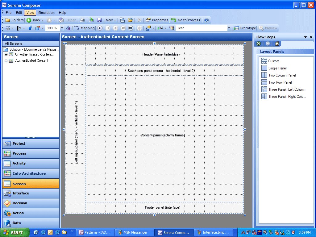
Screen (new step)
I envision that this step would occur immediately after the Info Architecture step.
A Screen (a net new of object for Composer) differs from an Interface in that it always represent the complete visual deliverable to the end users computer. The breakdown of a Screen into functional zones can be described as the Screen architecture. Screen architecture is important to increase usability of applications by enabling regular position of content between screens. It is common for web applications to contain a number of different Screens normally however they will all contain certain panels in common for example - header panel, main menu panel and footer panel.
I envision that within this screen step Composer users will be able to define the functional zones that make up the entire screen using functionality similar to that of Layout Panels found currently in the Interface step. However in this case the user would be able to add and edit a layout panel arrangement but also bind content to each panel in the layout.For example to use the screen step the user would do the following:
- Either select a screen from the list of screens in the left hand pane or create a new screen
- Right click on the screen to set its properties
Name (Authenticated Content Screen)
Requirement binding (Screen architecture requirement) - Drag Layout from Layout Panel pane
Edit proportions of panels until layout until proportions are satisfactory - Right click on top panel and set its properties
Name (Header panel)
Content type (interface)
Content binding (Header interface) - Right click on left panel and set its properties
Name (Left hand menu panel)
Content type (menu - vertical)
Content binding (level 1) - Right click on horizontal panel just below Header panel and set its properties
Name (Sub menu panel)
Content type (menu - horizontal)
Content binding (level 2) - Right click on main panel and set its properties
Name (Content panel)
Content type (activity frame) - Right click on bottom horizontal panel and set its properties
Name (Footer panel)
Content type (interface)
Content Binding (Footer interface)
Menu - new control
For Composer to support the automatic creation of an IAD it would need menu controls. In the PIA arena the design of menus can have a high impact on usability. The following is a discussion on why persistent menu systems are preferred.
Web applications are inherently latent. That is to say every screen refresh has a time cost in the order of two to eight seconds to the user. This time cost to users of web applications is a significant usability factor – many would say the most significant factor. This adds up to users of web applications tending to be reluctant to interact with a system unnecessarily due to latency. When they do interact forcing a page refresh, they do so only when confident that their interaction (click) will result in their intended requirement being met. As such whatever the UI can do to increase interaction confidence will result in higher usability scores.
Experience has shown that persistent visual indication of menu context increases interaction confidence. Menu systems that dynamically popup submenus based on roll over or clicking fail to meet this persistence requirement. Dynamic menu systems hide menu context and score low in usability for web applications. The essence to the reason for persistence in menu context can be summarized by the age old saying - “out of sight out of mind”.
This visual context becomes more challenging when an application needs to support more than two levels of menu hierarchy. In this case visual context can be maintained through the use of in content area page navigation (sub sub tabs) and breadcrumbs.
As such if you throw out the plethora of script based non persistent menu systems, currently there are really only two standard types of menu commonly used:
Vertical - tree
Horizontal - tabs
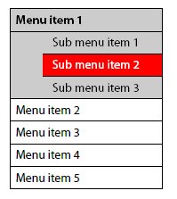
Vertical tree menu system
This type of navigation system is normally presented in a zone under the banner on the left hand side and usually will only show two levels of navigation but on the odd occasion three levels is required…
Horizontal tabs menu system
This type of menu system can show one or two levels of navigation only. However a third level can sometimes be represented as in the content area sub sub tabs…

I would imagine that the properties windows for the menu control would include the ability to:
Define the type of menu (vertical or horizontal)
Define the number of levels the menu control was to support
Define the number of entities in each level (specify interface linkage and text)
Various styling controls for both selected and unselected states (height, width, background color, border, text style etc)
 Posts
Posts


No comments:
Post a Comment