Wednesday, March 15, 2006

Patterns - Page Scaling

This is the third post in the serious on design patterns, discusses the enabling of large data sets in web applications.

Unlike embedded and client installed applications, bandwidth constraints have traditionally forced UI designers of Paged Internet Applications (PIAs) to limit the amount of data presented in any single page. The theory being the smaller the delivery package to the browser the less the latency to the end user (also in come cases very large or complex HTML templates can cause some browsers to crash).

This bandwidth restraint complicates the user experience in the case of large data sets. It necessitates that a large data set cannot be presented in a single screen but must be broken up over several pages. The patterns that are commonly used to traverse these "paged" data sets are the focus of this post.

The patterns that I am going to discuss in this post are:
- Paging
- Sorting
- Filtering

From a Composer point of view essentially all these patterns pertain to new features embedded in the repeating table control.
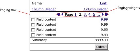
Paging
This pattern limits the number of rows presented of a data set in any one page. The features that make up this pattern normally appear in their own row above or below the column header row. The features normally include links to: first, last, previous, next, no. page and page set.


A number of feature variations exist in the paging pattern the following is breakdown of the most common variations:

  1. No. of rows
    Normally the number of rows presented in a page is pre-configured in the implementation

  2. Widget layout
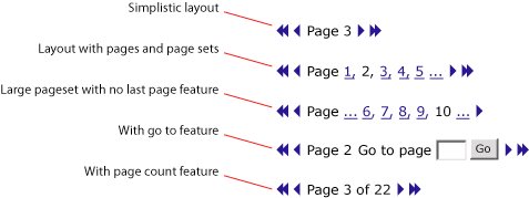
    1. Simplistic layout - some applications simplify the paging widgets by not including pages and page sets options.

    2. Pages and page sets - some applications provide page numbers and page set

    3. Extra large page sets - some applications due to very large scaling requirements will not give large page feature

    4. "Go to" feature - some applications will provide a "go to page" feature

    5. Page count feature - some will count the total number of pages and include it
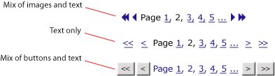
  3. Widget symbols
    1. Mix of imagines and text - some applications will present first, last, next and previous widgets as images links. In this case the shape and colors of images should be user assignable

    2. Text only - some applications will present all widgets as text links
      Mix of buttons and text - some applications will present first, last, next and previous widgets as buttons


  4. Dynamic linksNormally the widget set presented is dynamic. That is to say buttons/images/text links that are not relevant for a specific state are removed from the screen…


Composer paging support implications
To support paging flexibly I envision a new tab "Paging" being added to the repeating table controls properties popup window. I see this Paging tab offering the following options for users:
  • Turn paging on/off

  • Position paging widget set (align left/right, above/below header row)

  • Pick paging widget layout (drop down with different styles - see above)

  • Format paging widgets (drop down with images, text, buttons and upload images function which images selected)

  • Set no. of rows per page

  • Format text (font, color, size etc)


Sorting
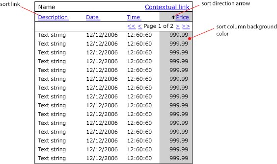
Sorting of columns of data is generally a useful feature. However in the case of paged data sets it is a requirement. In many cases sorting can result in less clicks for a user to find the most pertinent items in a large data set. For example in a large list of items a use may quickly find the most expensive by sorting the value/price column - to find this item via the paging functionality could be tiresome.

This feature is normally implemented to enable sorting of different field types including: string, numbers, date and time. In some cases the current sort state will be shown visually through either up and down arrows next to the header column description and or a change in background color of the sorted column…


Composer sorting support implications
I expect that all the features required to implement sorting in Composer could enabled through the addition of:

  • A sort checkbox next to each row in the Repeating Table control properties popup in the Table tab.

  • Add the following sorting features in the Repeating Table control properties popup in the Table tab:

    • Turn sorting arrows on/off

    • Upload sorting arrows images

    • Turn sort column color on/off

    • Specify sort column color


Filtering
Filtering and searching are essentially the same pattern. However I define filtering to mean searching within a paged data set. This features that makeup this pattern normally appear aligned right in a row above the column header row or in the same row and to the left of the paging widgets…


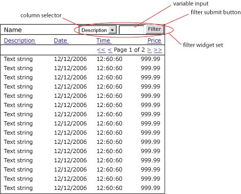
While a relatively new pattern to appear in web applications, filtering functionality is especially applicable where large data sets are common. Filtering further reduces the need for multiple clicks to finding pertinent rows with a large data set. To some extent filtering can be viewed as embedded analytics enabling users to turn any output module where it is implemented into a mini report.

The features that make up the filter pattern can occur in a number of difference variations. The following are three of the most common:

  1. Simple - this is the most simplistic approach which while easy for the user does result in significantly more processing for the server. In this case any matching is done across all columns in the data set.

  2. Standard - this approach is the most common, enabling users to define which column is to be filtered.
  3. Advanced - by adding the operator drop down users can further define the scope of the results returned by the system.


Composer filtering support implications
I expect that filtering could be supported in a similar manner to that described for paging with a new "Filtering" tab being added to the repeating table controls properties popup window. I see this Filtering tab offering the following options for users:
  • Turn filtering on/off

  • Position filtering widget (above header row, left of paging row etc)

  • Pick widget layout (a, b or c)

  • Format text (font, color etc)

Tuesday, March 14, 2006

Common Patterns - IADs

The following is the second post in a discussion on the common web design patterns and processes that I think Composer should support natively. The patterns that I am looking to promote initially are based purely on PIAs (paged internet applications), at this stage RIAs (rich internet applications) are out of scope.

What is an Information Architecture Diagram (IAD)
The IAD is one of the classic deliverables early in the software elaboration process. In the case of Paged Internet Applications (PIAs) this diagram is relatively simple to develop providing a clear map of all the screens within an application and how they are accessed through the menu system.

“In October 2000, Jesse James Garrett introduced a site architecture documentation standard called the Visual Vocabulary. Since then, it has become widely adopted among information architects and user experience professionals. The Visual Vocabulary is a simple set of shapes for documenting site architectures.” (http://www.jjg.net/ia/visvocab/)

The following is an example of a site map using the Visual Vocabulary.


The diagram reads from top to bottom, left to right. Ovals represent menu items horizontal rectangles represent screens. Objects made with broken lines are optional and normally have some associated text to explain the option logic eg Admin & Manager only.

What value do IADs bring?
The IAD provides a complete view of an entire application from an information architecture perspective.

IADs would enable the Composer user to:
Meet current deliverable expectationsThe IAD is regarded by many as part of the elaboration document for signoff. Currently it is not supported by Composer and thus leaves a hole in the traditional signoff document.
Provide a high level view from user experience perspectiveThe IAD is a great place to begin the review of an application from a user experience perspective. From this high level view stake holders can see the complete application in context.
Strategically place functionalityAs such the IAD shows the mapping of content/functionality to the menu system. Getting this mapping right is a fundamental building block to creating highly useable applications as experience has shown that users who arrive at an application with an externally prompted use case will look at the menu system to find the functionality to complete this use case.

For example, lets take this externally prompted use case scenario:
Step 1 - User gets a call from a potential customer
Step 2 - User enters system to add a new contact

In this scenario the user is more likely to look at the menu system first in order complete the use case than in the content area of the page. On selection of the most appropriate menu item the user will then look for a second level item to further focus on the required functionality. On exhausting menu possibilities the user will then begin to study the content area of the page for the functionality required to create a new contact.

This focus on the menu system for externally prompted use cases emphasizes the strategic importance of the menu system i.e. the information architecture as the basis for high usability.

Another interesting aspect of the value of IAD support in Composer would be the inclusion of the Information Architecture fraternity into the mix of users. Currently many Information Architects (IAs) do not see much value in specification and simulation tools. Composer provides no native support for IA related issues, leaving those with a focus on such issues out in the cold. The inclusion of native support for IADs should turn the heat up on this interest significantly.

Implication of IAD support for Composer
My vision of IAD support within Composer would result in the incorporation of two new steps in the composition flow (Info Architecture and Screen) and a new control to populate the Controls panel in the Interface step (Menu).

Info Architecture (new step)The development of the IAD comes right at the start of the elaboration process. As such it makes sense to introduce it early in the Composer process. However in this case I think it makes sense to include Info Architecture under the Activity step.
I envision that the Info Architecture step would enable users to drag and drop Jesse James's visual vocabulary objects onto the main pane, naming them and connecting them together to create a diagram in a similar manner to the Process and Activity steps just with different icons populating the Step Library pane.For example to create a IAD the user would do the following:
  1. Drag a screen icon from the Step Library
    Right click on the screen icon to set its properties:
    Name (Login)
    Screen binding (Non-authenticated Content Screen)
    Activity binding (Login Activity)
    Requirement binding (Login Requirement)
  2. Drag a menu item from the Step Library and place it under screen icon
    Right click on menu item to set its properties:
    Name (Main menu)
    Manage menu items (add Statements, Payments and Profile)
  3. Drag a menu icon from the Step Library and place it under the Payments Main menu item icon
    Right click on new menu item icon to set properties
    Name (Payment submenu)
    Manage menu items (add Quickpay, Recurring and History)
  4. Drag screen icon from the Step Library and place it under the Quickpay Payments submenu item icon
    Right click on new screen icon to set properties
    Name (Quickpay)
    Screen binding (Authenticated Content Screen)
    Activity binding (Quickpay Activity)
    Requirement binding (One time payment requirement)


Currently I'm debating whether or not to add another feature which would enable users to view activity flows within the IAD view. This feature is interesting in that it would potentially product a full IAD similar to that featured in the top of this article. However it would also add significant complexity to the diagram itself reducing its value as a high level tool for viewing content in context.

Screen (new step)
I envision that this step would occur immediately after the Info Architecture step.

A Screen (a net new of object for Composer) differs from an Interface in that it always represent the complete visual deliverable to the end users computer. The breakdown of a Screen into functional zones can be described as the Screen architecture. Screen architecture is important to increase usability of applications by enabling regular position of content between screens. It is common for web applications to contain a number of different Screens normally however they will all contain certain panels in common for example - header panel, main menu panel and footer panel.

I envision that within this screen step Composer users will be able to define the functional zones that make up the entire screen using functionality similar to that of Layout Panels found currently in the Interface step. However in this case the user would be able to add and edit a layout panel arrangement but also bind content to each panel in the layout.For example to use the screen step the user would do the following:

  1. Either select a screen from the list of screens in the left hand pane or create a new screen

  2. Right click on the screen to set its properties
    Name (Authenticated Content Screen)
    Requirement binding (Screen architecture requirement)

  3. Drag Layout from Layout Panel pane
    Edit proportions of panels until layout until proportions are satisfactory

  4. Right click on top panel and set its properties
    Name (Header panel)
    Content type (interface)
    Content binding (Header interface)
  5. Right click on left panel and set its properties
    Name (Left hand menu panel)
    Content type (menu - vertical)
    Content binding (level 1)
  6. Right click on horizontal panel just below Header panel and set its properties
    Name (Sub menu panel)
    Content type (menu - horizontal)
    Content binding (level 2)
  7. Right click on main panel and set its properties
    Name (Content panel)
    Content type (activity frame)
  8. Right click on bottom horizontal panel and set its properties
    Name (Footer panel)
    Content type (interface)
    Content Binding (Footer interface)


Menu - new control
For Composer to support the automatic creation of an IAD it would need menu controls. In the PIA arena the design of menus can have a high impact on usability. The following is a discussion on why persistent menu systems are preferred.

Web applications are inherently latent. That is to say every screen refresh has a time cost in the order of two to eight seconds to the user. This time cost to users of web applications is a significant usability factor – many would say the most significant factor. This adds up to users of web applications tending to be reluctant to interact with a system unnecessarily due to latency. When they do interact forcing a page refresh, they do so only when confident that their interaction (click) will result in their intended requirement being met. As such whatever the UI can do to increase interaction confidence will result in higher usability scores.

Experience has shown that persistent visual indication of menu context increases interaction confidence. Menu systems that dynamically popup submenus based on roll over or clicking fail to meet this persistence requirement. Dynamic menu systems hide menu context and score low in usability for web applications. The essence to the reason for persistence in menu context can be summarized by the age old saying - “out of sight out of mind”.

This visual context becomes more challenging when an application needs to support more than two levels of menu hierarchy. In this case visual context can be maintained through the use of in content area page navigation (sub sub tabs) and breadcrumbs.

As such if you throw out the plethora of script based non persistent menu systems, currently there are really only two standard types of menu commonly used:
Vertical - tree
Horizontal - tabs

Vertical tree menu system
This type of navigation system is normally presented in a zone under the banner on the left hand side and usually will only show two levels of navigation but on the odd occasion three levels is required…


Horizontal tabs menu system
This type of menu system can show one or two levels of navigation only. However a third level can sometimes be represented as in the content area sub sub tabs…


I would imagine that the properties windows for the menu control would include the ability to:
Define the type of menu (vertical or horizontal)
Define the number of levels the menu control was to support
Define the number of entities in each level (specify interface linkage and text)
Various styling controls for both selected and unselected states (height, width, background color, border, text style etc)