Introduction
The following is the first post in a discussion on the common web design patterns and processes that I think Composer should support natively.
The patterns that I am looking to promote initially are based purely on PIAs (paged internet applications), at this stage RIAs (rich internet applications) are out of scope. The following is a quote from Bill Scott's "Storyboarding Rich Internet Applications in Viso" that I think elegantly defines the difference between the two:
The traditional paged Internet application (PIA—part of what is sometimes referred to as Web 1.0 or classic web) has these characteristics:
A rich Internet application (RIA—part of what is now called Web 2.0) behaves like this:
- The user enters information at the page level or clicks on a link to go to another page.
- The page refreshes to show the result of the user's request.
- Everything is framed in the context of a document content model.
- The user interacts directly with items within the page and the feedback is immediate.
- The page does not have to refresh to complete the user's interaction (data flows seamlessly in the background, allowing for instant feedback).
- The interface can be thought of as an application model containing interface objects.
I believe good PIA design patterns are essential for Composer to support natively if it wishes to fulfill its promise as the specification and simulation tool of choice for web application development. But this is a blog and I welcome your input - do you disagree? Do you believe I have missed something important? If so I welcome your comments and suggestions. Here is a list of the patterns I'm looking to cover off:
1. Web Modules
A handy way of packaging content and the no.1 player in site furniture. In this discussion I define what a web module is, why it's so important and how it could be supported in the current Composer UI.
2. IADs (information architecture diagram)
It seems many information architects cannot see the value in software specification and simulation tools. The IAD hero deliverable currently not supported by Composer but to my way of thinking it is only a short step away from doing so. In this discussion I define what an IAD is, why it's important and how it could be supported in the current Composer UI.
3. Performance scaling (paging, sorting, searching/filtering, drill downs)
Bandwidth constraints make performance the major usability issue for web applications. As such the ability to simulate the patterns developers use to enable their apps to scale is important. In this discussion I cover off each of these patterns, why they are important and how they could be supported in the current Composer UI.
What is a web module?
A web module is a self contained package of content which follows a standard format in a web page. Much of the data and functionality delivered in web applications today is presented in web modules.

The majority of content presented on this screen is packaged in a web module of one type or another. The following diagram points out the web modules...

The following are some examples of popular web applications that utilize web modules:


This current culture of modularizing web application design is influencing the development of standards. In some respects the JSR 168 Portlet standard is a result of both the Web Module culture of packaging content into self contained units and the increasing need to simplify the aggregation of data from multiple systems into a single page.
Web modules are also a useful means to standardize the presentation of web content. They provide strong visual cues to the beginning and end of individual content subjects and functional units. For example in the case where an application requires a user to enter data a web module can add significant value by providing:
a) a strong visual cue that input is required of the user (the use of a strong background color)
b) a container for all content associated with the transaction
c) a standard place for a verbal call to action to appear
d) a standard position for transaction buttons to appear
All Web Modules have the following items in common:
Header row
This row (normally with a contrasting background color to the page color) always contains the web module name but also can optionally contain contextually relevant links.
Descriptor
This is the verbal description of the content which the Web Module encapsulated
Content area
This box (normally with a different background color to that of the header row) provides a container for the actual web module content.

The following is a description of the three main type of Web Module.
The output Web Module
Output web modules as the name implies are containers for system output. The nature of this type of web module is to promote user consumption of information. However you will see in some cases the module content can include hyperlinks to enable navigation to further detail or associated content.
There are three common variations of output web module type:
- Message
Typically this variation is used to display a system message. The content box is populated with free text which can optionally contain hyperlinks. - List
Typically this variation is used to display a link list. In this variation the content box is populated with a single repeating field. - Table
Typically this variation is used to display a multi column table. Note: a column header row is required. Other optional features include: column header sort links, paging row, row selection widget (checkbox or radio button), content link, summary (added up value) row and transaction button row.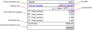
The multi Web Module
A relatively new player on the block this type of web module is used to display both visual and textual content in the same package. This type of web module is increasingly popular as it enhances the value of the content being displayed while decreasing perception of complexity.
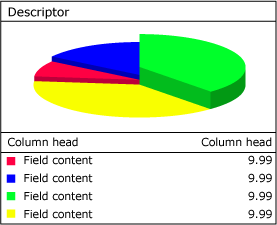
Multi web module vertical variation
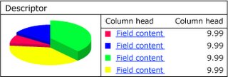
Multi web module horizontal variation
An essential ingredient of the multi web module type is the tight correlation between image and text content. The above illustration presents a classic multi web module implementation where the exactly the same content presented in the pie graph on the left is repeated in the table on the right. N.B. in this case users are supplied links to the value column amounts to drill down to more detail.
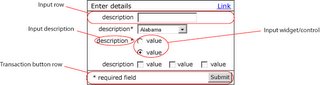
The input web module
Input web modules as the name implies are containers for user input. The nature of this type of web module is to promote users to enter information. As previously mentioned user input can represent the most stressful part of a users experience with an application. As such an effective strategy to reduce and simplify user input can have a significant impact on usability.
The container box of an input web module always contains one or more input rows and a transaction button row. This model promotes a simple one column approach whereby the user completes the form by starting at the top and working his or her way down to the bottom to where the transaction button(s) are located.
Implication of Web Module support for Composer
It is my belief that Composer could add significant value to user by implementing Web Modules within the interface page in the layout panels pane…
Currently to model Web Module a user must use one of the layout panels as the basis for building the required header row and content box. The addition of panels with associated properties configure optional elements could significantly speed up the development of interfaces while increasing consistency and conforming them to current best practices.
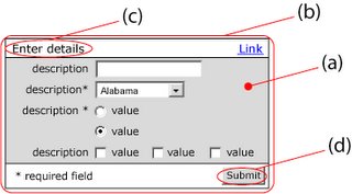
For example: I envision a new layout panel called "input Module". On selection of this panel the user would be able to drag a rectangle on the Interface Design pane and be left with the following result…
On right clicking of this object and selection of properties it would allow the user to configure the "Input Module". Configuration could include such things as:
- Background color and height of header row
- "Name" text and attributes
- "Optional Link" management
- Background color of content area
- Background color of height of transaction row
- Button management including alignment
 Posts
Posts


No comments:
Post a Comment