Monday, March 27, 2006

Patterns - Breadcrumbs & Page Name

The fifth post in this series on design patterns for Serena Composer focus's on common site furniture objects - breadcrumbs and page name. There is significant opportunity to automate the implementation of these patterns within Composer and as such worthy of discussion.

Breadcrumbs
Breadcrumbs is the term used to describe a series of links presented at the top left of the content area (activity frame) which allow the user to see where he/she is in context with the information architecture of the application.


It is important at this time to make a distinction between breadcrumbs and what I call historical links.

Historical Links
As the name implies historical links are a list of links (normally presented horizontally) of previously visited by the user in that current session. The URLs that populate historical links do not represent the information architecture and as such while they allow the customer to back track more easily do little to illustrate current application context.

Breadcrumbs
Like historical links breadcrumbs provide a list of links however in this case the links are aligned with the information architecture of the application. In this case the links show then end user a clear representation of current context as well as providing an alternative method to navigate up the information hierarchy.

To illustrate this distinction lets take an application with the following information architecture. The steps taken by the user are denoted in red…


The following are the links lists after the fifth navigation step…


Some would argue that historical links offer more value to the end user than breadcrumbs due to the extra detail they provide users on session history. However with this comes a number of disadvantages:

  • Scaling issueScreen real-estate quickly becomes an issue after five or so pages have been visited within any one session

  • Invalid linksIn many cases links to previously visited pages will expire making the linkage invalid

  • Native browser support alreadyAll browsers support page history natively reducing the value add of historical links significantly

  • Information overloadLarge link lists further add to the complexity of the user experience

  • Promotes off take of previously viewed/old contentHistorical links do not help the user understand where he/she is within an application only where he/she has been before. Assuming the user has already completed his/her tasks in the previously visited pages it is facilitation of navigation to unviewed/new content that should be the focus of the UI design rather than the promotion of old content.

Breadcrumbs are regarded as superior alternative to historical links due to the following advantages:

  • ScalingIt is very rare that breadcrumbs links will grow to over five items. In the case where this happens often it is likely there is an information architecture strategy issue to be solved ahead of time.

  • Valid linksBreadcrumbs tend to be comprised of valid links due to their information architecture alignment.

  • No native browser supportThe back button in browsers takes you to the previously visited page - it does not take into account the information architecture and as such the addition of breadcrumbs is net new functionality.

  • Information simplificationWhile it is true breadcrumbs do add complexity to the user interface they are relatively simple in comparison with historical links.

  • Promotes off take of unviewed/new contentClear illustration of information architecture context helps to make the process of navigation to new content simpler for users.

Breadcrumbs are presented in a pretty generic manner in most web applications. They tend to appear in the top left of the content area (activity frame) just above or below the page name. Each link is normally separated with a non linked character or image. The link description is normally populated with the "page name" for that URL…

Normally the current page is shown as the last element in the breadcrumb and not linked.


Composer breadcrumbs support implications
It is proposed that support of breadcrumbs be included as part of IAD support. With IAD support in Composer the addition of breadcrumbs should be trivial.

I envision breadcrumb support would take the form of a new widget being added to the controls pane in the interface screen. By dragging the breadcrumb widget to an interface the user could configure its formatting by right clicking and altering the following properties:
  • Type (font, color, size etc)

  • Separator (character, image, upload image)

Page Name
The page name is an obvious pattern it is just the presentation of the page name within the content area (activity frame)…


Automation of the page name within Composer would allow end users to effect the Page Names presented in the simulation of the application from the activity screen by changing the description of the interface icons in the activity flow pane.

Composer page name support implications
I envision page name support would take the form of a new widget being added to the controls pane of the interface screen. By dragging the page name to an interface the user could configure its formatting by right clicking and altering the following properties:
  • Type (font, color, size etc)

Wednesday, March 22, 2006

Patterns - Drilldown & Search

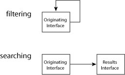
This fourth post on design patterns this article discusses the search and drilldown patterns. These patterns involve navigation of data sets however unlike paging, sorting and filtering which occur in a single interface these patterns occur over two interfaces which I will define as follows:

  1. Originating interface
    The interface where the user begins the data set navigation process

  2. Results interface
    The interface which is returned by the system as a result of the data submitted in the originating interface.
To help further clear up the distinction between single interface data set navigation and multiple interface data set navigation lets look at an example of each.

Single interface data set navigation - filtering
Filtering call records

  1. System presents screen containing a web module with call details

  2. User enters telephone number into filter input widget and presses filter button

  3. System filters rows in the web module with call details to show only those made to the number specified by the user in step 2
Note: In this scenario the user submits filtering details to the originating interface - in effect staying in the same interface through the navigation process.

Multiple interface data set navigation - searching
Searching call records

  1. System presents a screen containing search criteria input widgets

  2. User selects "call details" in the data type drop down widget, enter telephone number into string input widget and presses search button

  3. System returns the results screen containing web module with call details made to the number specified by the user in step 2
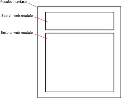
Note: In this scenario the user moves from the originating interface to a results interface. Please note it is common for the originating interface to be included in the results interface to more easily allow users to re-search.


Search
Search is probably the most commonly occurring design pattern in the web today. As such it very familiar to users both novice and expert. Normally the search pattern includes two versions of the originating interface:

Simple Search
A basic string input and submit control set which in many cases is presented in the header or a side panel in the screen when will result in this functionality appearing in all pages of an application.


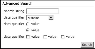
Advanced Search
This interface is normally populates the activity frame and accessed from a link next to the simple search interface. Advanced search provides more controls to allow the user to refine his/her search thereby reducing the number of returned items in the following results interface.


Note: it is common for the search results interface to embed the content of the originating interface to simply the process of re-searching.


Composer Search support implications
I have give some thought to how search could be supported simply within the current Composer UI. However a simple method of doing so escapes me, I expect a new kind of "Search" Action will need to be added to the Step Library in the Activity screen.

I envision the screen to edit this Search Action will include the ability to define the data sets which will be in scope. Using the standard mapping interface the user would be able to map the output of the Search Action to the results interface.

Drilldown
An elegant way to support drilldown within Composer I believe is a very strong requirement due to this patterns common usage in many web applications.


Currently drilldown functionality can be "faked" within Composer however this "faking" severely reduces the fidelity of the simulation and I feel significantly reduces the value that the tool adds to users. The ability to support n levels of drilldown needs to be supported to fully enable this pattern as within an application the end user maybe required to drill down more than once to find details on any one item.


Composer Drilldown support implications
Similar to Search support, Drilldown does not require a simple change. On some thought I figure that like Search Drilldown could be supported using the same "Search" Action feature however in this case the scope of the search would be set to only one data set. Once again the results could be mapped using the current mapping interface approach.

Wednesday, March 15, 2006

Patterns - Page Scaling

This is the third post in the serious on design patterns, discusses the enabling of large data sets in web applications.

Unlike embedded and client installed applications, bandwidth constraints have traditionally forced UI designers of Paged Internet Applications (PIAs) to limit the amount of data presented in any single page. The theory being the smaller the delivery package to the browser the less the latency to the end user (also in come cases very large or complex HTML templates can cause some browsers to crash).

This bandwidth restraint complicates the user experience in the case of large data sets. It necessitates that a large data set cannot be presented in a single screen but must be broken up over several pages. The patterns that are commonly used to traverse these "paged" data sets are the focus of this post.

The patterns that I am going to discuss in this post are:
- Paging
- Sorting
- Filtering

From a Composer point of view essentially all these patterns pertain to new features embedded in the repeating table control.

Paging
This pattern limits the number of rows presented of a data set in any one page. The features that make up this pattern normally appear in their own row above or below the column header row. The features normally include links to: first, last, previous, next, no. page and page set.


A number of feature variations exist in the paging pattern the following is breakdown of the most common variations:

  1. No. of rows
    Normally the number of rows presented in a page is pre-configured in the implementation

  2. Widget layout
    1. Simplistic layout - some applications simplify the paging widgets by not including pages and page sets options.

    2. Pages and page sets - some applications provide page numbers and page set

    3. Extra large page sets - some applications due to very large scaling requirements will not give large page feature

    4. "Go to" feature - some applications will provide a "go to page" feature

    5. Page count feature - some will count the total number of pages and include it

  3. Widget symbols
    1. Mix of imagines and text - some applications will present first, last, next and previous widgets as images links. In this case the shape and colors of images should be user assignable

    2. Text only - some applications will present all widgets as text links
      Mix of buttons and text - some applications will present first, last, next and previous widgets as buttons


  4. Dynamic linksNormally the widget set presented is dynamic. That is to say buttons/images/text links that are not relevant for a specific state are removed from the screen…


Composer paging support implications
To support paging flexibly I envision a new tab "Paging" being added to the repeating table controls properties popup window. I see this Paging tab offering the following options for users:
  • Turn paging on/off

  • Position paging widget set (align left/right, above/below header row)

  • Pick paging widget layout (drop down with different styles - see above)

  • Format paging widgets (drop down with images, text, buttons and upload images function which images selected)

  • Set no. of rows per page

  • Format text (font, color, size etc)


Sorting
Sorting of columns of data is generally a useful feature. However in the case of paged data sets it is a requirement. In many cases sorting can result in less clicks for a user to find the most pertinent items in a large data set. For example in a large list of items a use may quickly find the most expensive by sorting the value/price column - to find this item via the paging functionality could be tiresome.

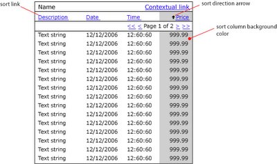
This feature is normally implemented to enable sorting of different field types including: string, numbers, date and time. In some cases the current sort state will be shown visually through either up and down arrows next to the header column description and or a change in background color of the sorted column…


Composer sorting support implications
I expect that all the features required to implement sorting in Composer could enabled through the addition of:

  • A sort checkbox next to each row in the Repeating Table control properties popup in the Table tab.

  • Add the following sorting features in the Repeating Table control properties popup in the Table tab:

    • Turn sorting arrows on/off

    • Upload sorting arrows images

    • Turn sort column color on/off

    • Specify sort column color


Filtering
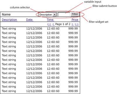
Filtering and searching are essentially the same pattern. However I define filtering to mean searching within a paged data set. This features that makeup this pattern normally appear aligned right in a row above the column header row or in the same row and to the left of the paging widgets…


While a relatively new pattern to appear in web applications, filtering functionality is especially applicable where large data sets are common. Filtering further reduces the need for multiple clicks to finding pertinent rows with a large data set. To some extent filtering can be viewed as embedded analytics enabling users to turn any output module where it is implemented into a mini report.

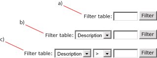
The features that make up the filter pattern can occur in a number of difference variations. The following are three of the most common:

  1. Simple - this is the most simplistic approach which while easy for the user does result in significantly more processing for the server. In this case any matching is done across all columns in the data set.

  2. Standard - this approach is the most common, enabling users to define which column is to be filtered.
  3. Advanced - by adding the operator drop down users can further define the scope of the results returned by the system.


Composer filtering support implications
I expect that filtering could be supported in a similar manner to that described for paging with a new "Filtering" tab being added to the repeating table controls properties popup window. I see this Filtering tab offering the following options for users:
  • Turn filtering on/off

  • Position filtering widget (above header row, left of paging row etc)

  • Pick widget layout (a, b or c)

  • Format text (font, color etc)

Tuesday, March 14, 2006

Common Patterns - IADs

The following is the second post in a discussion on the common web design patterns and processes that I think Composer should support natively. The patterns that I am looking to promote initially are based purely on PIAs (paged internet applications), at this stage RIAs (rich internet applications) are out of scope.

What is an Information Architecture Diagram (IAD)
The IAD is one of the classic deliverables early in the software elaboration process. In the case of Paged Internet Applications (PIAs) this diagram is relatively simple to develop providing a clear map of all the screens within an application and how they are accessed through the menu system.

“In October 2000, Jesse James Garrett introduced a site architecture documentation standard called the Visual Vocabulary. Since then, it has become widely adopted among information architects and user experience professionals. The Visual Vocabulary is a simple set of shapes for documenting site architectures.” (http://www.jjg.net/ia/visvocab/)

The following is an example of a site map using the Visual Vocabulary.


The diagram reads from top to bottom, left to right. Ovals represent menu items horizontal rectangles represent screens. Objects made with broken lines are optional and normally have some associated text to explain the option logic eg Admin & Manager only.

What value do IADs bring?
The IAD provides a complete view of an entire application from an information architecture perspective.

IADs would enable the Composer user to:
Meet current deliverable expectationsThe IAD is regarded by many as part of the elaboration document for signoff. Currently it is not supported by Composer and thus leaves a hole in the traditional signoff document.
Provide a high level view from user experience perspectiveThe IAD is a great place to begin the review of an application from a user experience perspective. From this high level view stake holders can see the complete application in context.
Strategically place functionalityAs such the IAD shows the mapping of content/functionality to the menu system. Getting this mapping right is a fundamental building block to creating highly useable applications as experience has shown that users who arrive at an application with an externally prompted use case will look at the menu system to find the functionality to complete this use case.

For example, lets take this externally prompted use case scenario:
Step 1 - User gets a call from a potential customer
Step 2 - User enters system to add a new contact

In this scenario the user is more likely to look at the menu system first in order complete the use case than in the content area of the page. On selection of the most appropriate menu item the user will then look for a second level item to further focus on the required functionality. On exhausting menu possibilities the user will then begin to study the content area of the page for the functionality required to create a new contact.

This focus on the menu system for externally prompted use cases emphasizes the strategic importance of the menu system i.e. the information architecture as the basis for high usability.

Another interesting aspect of the value of IAD support in Composer would be the inclusion of the Information Architecture fraternity into the mix of users. Currently many Information Architects (IAs) do not see much value in specification and simulation tools. Composer provides no native support for IA related issues, leaving those with a focus on such issues out in the cold. The inclusion of native support for IADs should turn the heat up on this interest significantly.

Implication of IAD support for Composer
My vision of IAD support within Composer would result in the incorporation of two new steps in the composition flow (Info Architecture and Screen) and a new control to populate the Controls panel in the Interface step (Menu).

Info Architecture (new step)The development of the IAD comes right at the start of the elaboration process. As such it makes sense to introduce it early in the Composer process. However in this case I think it makes sense to include Info Architecture under the Activity step.
I envision that the Info Architecture step would enable users to drag and drop Jesse James's visual vocabulary objects onto the main pane, naming them and connecting them together to create a diagram in a similar manner to the Process and Activity steps just with different icons populating the Step Library pane.For example to create a IAD the user would do the following:
  1. Drag a screen icon from the Step Library
    Right click on the screen icon to set its properties:
    Name (Login)
    Screen binding (Non-authenticated Content Screen)
    Activity binding (Login Activity)
    Requirement binding (Login Requirement)
  2. Drag a menu item from the Step Library and place it under screen icon
    Right click on menu item to set its properties:
    Name (Main menu)
    Manage menu items (add Statements, Payments and Profile)
  3. Drag a menu icon from the Step Library and place it under the Payments Main menu item icon
    Right click on new menu item icon to set properties
    Name (Payment submenu)
    Manage menu items (add Quickpay, Recurring and History)
  4. Drag screen icon from the Step Library and place it under the Quickpay Payments submenu item icon
    Right click on new screen icon to set properties
    Name (Quickpay)
    Screen binding (Authenticated Content Screen)
    Activity binding (Quickpay Activity)
    Requirement binding (One time payment requirement)
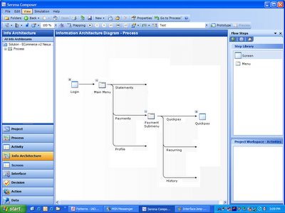


Currently I'm debating whether or not to add another feature which would enable users to view activity flows within the IAD view. This feature is interesting in that it would potentially product a full IAD similar to that featured in the top of this article. However it would also add significant complexity to the diagram itself reducing its value as a high level tool for viewing content in context.

Screen (new step)
I envision that this step would occur immediately after the Info Architecture step.

A Screen (a net new of object for Composer) differs from an Interface in that it always represent the complete visual deliverable to the end users computer. The breakdown of a Screen into functional zones can be described as the Screen architecture. Screen architecture is important to increase usability of applications by enabling regular position of content between screens. It is common for web applications to contain a number of different Screens normally however they will all contain certain panels in common for example - header panel, main menu panel and footer panel.

I envision that within this screen step Composer users will be able to define the functional zones that make up the entire screen using functionality similar to that of Layout Panels found currently in the Interface step. However in this case the user would be able to add and edit a layout panel arrangement but also bind content to each panel in the layout.For example to use the screen step the user would do the following:

  1. Either select a screen from the list of screens in the left hand pane or create a new screen

  2. Right click on the screen to set its properties
    Name (Authenticated Content Screen)
    Requirement binding (Screen architecture requirement)

  3. Drag Layout from Layout Panel pane
    Edit proportions of panels until layout until proportions are satisfactory

  4. Right click on top panel and set its properties
    Name (Header panel)
    Content type (interface)
    Content binding (Header interface)
  5. Right click on left panel and set its properties
    Name (Left hand menu panel)
    Content type (menu - vertical)
    Content binding (level 1)
  6. Right click on horizontal panel just below Header panel and set its properties
    Name (Sub menu panel)
    Content type (menu - horizontal)
    Content binding (level 2)
  7. Right click on main panel and set its properties
    Name (Content panel)
    Content type (activity frame)
  8. Right click on bottom horizontal panel and set its properties
    Name (Footer panel)
    Content type (interface)
    Content Binding (Footer interface)


Menu - new control
For Composer to support the automatic creation of an IAD it would need menu controls. In the PIA arena the design of menus can have a high impact on usability. The following is a discussion on why persistent menu systems are preferred.

Web applications are inherently latent. That is to say every screen refresh has a time cost in the order of two to eight seconds to the user. This time cost to users of web applications is a significant usability factor – many would say the most significant factor. This adds up to users of web applications tending to be reluctant to interact with a system unnecessarily due to latency. When they do interact forcing a page refresh, they do so only when confident that their interaction (click) will result in their intended requirement being met. As such whatever the UI can do to increase interaction confidence will result in higher usability scores.

Experience has shown that persistent visual indication of menu context increases interaction confidence. Menu systems that dynamically popup submenus based on roll over or clicking fail to meet this persistence requirement. Dynamic menu systems hide menu context and score low in usability for web applications. The essence to the reason for persistence in menu context can be summarized by the age old saying - “out of sight out of mind”.

This visual context becomes more challenging when an application needs to support more than two levels of menu hierarchy. In this case visual context can be maintained through the use of in content area page navigation (sub sub tabs) and breadcrumbs.

As such if you throw out the plethora of script based non persistent menu systems, currently there are really only two standard types of menu commonly used:
Vertical - tree
Horizontal - tabs

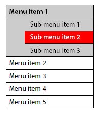
Vertical tree menu system
This type of navigation system is normally presented in a zone under the banner on the left hand side and usually will only show two levels of navigation but on the odd occasion three levels is required…

Horizontal tabs menu system
This type of menu system can show one or two levels of navigation only. However a third level can sometimes be represented as in the content area sub sub tabs…


I would imagine that the properties windows for the menu control would include the ability to:
Define the type of menu (vertical or horizontal)
Define the number of levels the menu control was to support
Define the number of entities in each level (specify interface linkage and text)
Various styling controls for both selected and unselected states (height, width, background color, border, text style etc)

Tuesday, February 28, 2006

Common Patterns - Web Modules

Introduction

The following is the first post in a discussion on the common web design patterns and processes that I think Composer should support natively.

The patterns that I am looking to promote initially are based purely on PIAs (paged internet applications), at this stage RIAs (rich internet applications) are out of scope. The following is a quote from Bill Scott's "Storyboarding Rich Internet Applications in Viso" that I think elegantly defines the difference between the two:

The traditional paged Internet application (PIA—part of what is sometimes referred to as Web 1.0 or classic web) has these characteristics:

  • The user enters information at the page level or clicks on a link to go to another page.
  • The page refreshes to show the result of the user's request.
  • Everything is framed in the context of a document content model.
A rich Internet application (RIA—part of what is now called Web 2.0) behaves like this:
  • The user interacts directly with items within the page and the feedback is immediate.
  • The page does not have to refresh to complete the user's interaction (data flows seamlessly in the background, allowing for instant feedback).
  • The interface can be thought of as an application model containing interface objects.

I believe good PIA design patterns are essential for Composer to support natively if it wishes to fulfill its promise as the specification and simulation tool of choice for web application development. But this is a blog and I welcome your input - do you disagree? Do you believe I have missed something important? If so I welcome your comments and suggestions. Here is a list of the patterns I'm looking to cover off:
1. Web Modules
A handy way of packaging content and the no.1 player in site furniture. In this discussion I define what a web module is, why it's so important and how it could be supported in the current Composer UI.
2. IADs (information architecture diagram)
It seems many information architects cannot see the value in software specification and simulation tools. The IAD hero deliverable currently not supported by Composer but to my way of thinking it is only a short step away from doing so. In this discussion I define what an IAD is, why it's important and how it could be supported in the current Composer UI.
3. Performance scaling (paging, sorting, searching/filtering, drill downs)
Bandwidth constraints make performance the major usability issue for web applications. As such the ability to simulate the patterns developers use to enable their apps to scale is important. In this discussion I cover off each of these patterns, why they are important and how they could be supported in the current Composer UI.

What is a web module?
A web module is a self contained package of content which follows a standard format in a web page. Much of the data and functionality delivered in web applications today is presented in web modules.

For example take a look at this screen wireframe...

The majority of content presented on this screen is packaged in a web module of one type or another. The following diagram points out the web modules...


The following are some examples of popular web applications that utilize web modules:


This current culture of modularizing web application design is influencing the development of standards. In some respects the JSR 168 Portlet standard is a result of both the Web Module culture of packaging content into self contained units and the increasing need to simplify the aggregation of data from multiple systems into a single page.

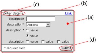
Web modules are also a useful means to standardize the presentation of web content. They provide strong visual cues to the beginning and end of individual content subjects and functional units. For example in the case where an application requires a user to enter data a web module can add significant value by providing:
a) a strong visual cue that input is required of the user (the use of a strong background color)
b) a container for all content associated with the transaction
c) a standard place for a verbal call to action to appear
d) a standard position for transaction buttons to appear


All Web Modules have the following items in common:

Header row
This row (normally with a contrasting background color to the page color) always contains the web module name but also can optionally contain contextually relevant links.

Descriptor
This is the verbal description of the content which the Web Module encapsulated

Content area
This box (normally with a different background color to that of the header row) provides a container for the actual web module content.

The following is a description of the three main type of Web Module.

The output Web Module
Output web modules as the name implies are containers for system output. The nature of this type of web module is to promote user consumption of information. However you will see in some cases the module content can include hyperlinks to enable navigation to further detail or associated content.

There are three common variations of output web module type:

  1. Message
    Typically this variation is used to display a system message. The content box is populated with free text which can optionally contain hyperlinks.
  2. List
    Typically this variation is used to display a link list. In this variation the content box is populated with a single repeating field.
  3. Table
    Typically this variation is used to display a multi column table. Note: a column header row is required. Other optional features include: column header sort links, paging row, row selection widget (checkbox or radio button), content link, summary (added up value) row and transaction button row.


The multi Web Module
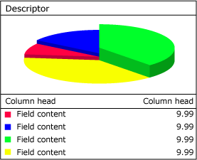
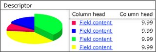
A relatively new player on the block this type of web module is used to display both visual and textual content in the same package. This type of web module is increasingly popular as it enhances the value of the content being displayed while decreasing perception of complexity.


Multi web module vertical variation


Multi web module horizontal variation

An essential ingredient of the multi web module type is the tight correlation between image and text content. The above illustration presents a classic multi web module implementation where the exactly the same content presented in the pie graph on the left is repeated in the table on the right. N.B. in this case users are supplied links to the value column amounts to drill down to more detail.

The input web module
Input web modules as the name implies are containers for user input. The nature of this type of web module is to promote users to enter information. As previously mentioned user input can represent the most stressful part of a users experience with an application. As such an effective strategy to reduce and simplify user input can have a significant impact on usability.

The container box of an input web module always contains one or more input rows and a transaction button row. This model promotes a simple one column approach whereby the user completes the form by starting at the top and working his or her way down to the bottom to where the transaction button(s) are located.


Implication of Web Module support for Composer
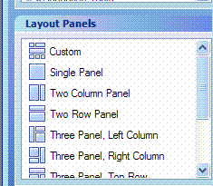
It is my belief that Composer could add significant value to user by implementing Web Modules within the interface page in the layout panels pane…


Currently to model Web Module a user must use one of the layout panels as the basis for building the required header row and content box. The addition of panels with associated properties configure optional elements could significantly speed up the development of interfaces while increasing consistency and conforming them to current best practices.

For example: I envision a new layout panel called "input Module". On selection of this panel the user would be able to drag a rectangle on the Interface Design pane and be left with the following result…


On right clicking of this object and selection of properties it would allow the user to configure the "Input Module". Configuration could include such things as:

  • Background color and height of header row
  • "Name" text and attributes
  • "Optional Link" management
  • Background color of content area
  • Background color of height of transaction row
  • Button management including alignment

Thursday, February 23, 2006

Issues No.3

3.1 - Performance degradation
Recently I have been noticing that the application has become slower and slower. Other applications that I am running such as OneNote and Outlook were not suffering the same performance degradation so naturally I assumed it was a Composer issue.

I started experimenting, turning network services off, removing extra projects in the projects folder, restarting the application, rebooting my laptop - nothing worked to make Composer faster. In the end I took a look at spare memory in the disc drive from which Composer is running and saw that it had only 1gig spare in the 10gig volume. I also found that this volume was also highly fragmented.

Since then I've removed a lot of data from the volume now have 2 or so gig free, de-installed Composer, defragged the drive and re-installed Composer.

The performance was initially excellent but now I am noticing it degrade again. It is particularly noticeable when trying to edit a text area. It would be great to be able to edit the value of a text area within the properties popup…


Currently when you change the name in the Text Area Properties it does not effect the text in the interface - another field here to enter the interface value would be great value I think.

We have already discussed the memory problem in a previous communication. We will look at adding another tab with rich text editor to enter this value.

3.2 - Modeling a shopping cart

I am in the process of modeling shopping cart functionality and am running into some issues. The following is snapshot of the activity flow…


The following is a simulation of the Shopping Cart interface...


a. I have disabled the links to the product detail (P900, P800) as this interface is covered in a different activity

b. I would very much like to enable user to change the "No." of units for each item and then with pressing of the "Update" button see the values for "Tax", "1x Amount", "Mthly Amount" and values in the total row to be recalculated and updated - is this possible and if so how do I do it?

c. The concept of a total row being supported by the repeating table control I think is very attractive - is this on the roadmap?

d. I have disabled the "Remove" link as currently I can't impact the test set from the simulation

At the moment, we don’t have any in-page actions or calculations. We also lack a true grid control where some of these calculations can be performed Both of these are on the roadmap for a future release.

3.3 - Adding repeating records into repeating table
The following is a snapshot of the activity manage saved shipping carts flow...


I would like user to be able to view an abridged list of items within a saved shopping cart. This requirement is part of the manage saved carts interface ...


I have created an Action output data model as such...


Note I have a repeating group inside the ShoppingCarts repeating group which contains three fields. In the Manage Cart interface I have added a repeating section to the "Content" column…


However for some reason when I drop the "Content" repeating table from the Activity Data for the LookUpSavedShoppingCarts activity nothing is added. Am I using the wrong approach to do this?

This is the same issue we already discussed, i.e. lack a local dataset and steps/controls to manipulate that data. Both are on the roadmap.

3.4 - Add current date as input I am modeling a function which allows users to save a shopping cart for later recall. As part of this process I would like to show the date stamp of the saved cart as part of the saving process…


Is it possible to assign the input to the current date? If not I believe this would be a useful addition.

It is possible to get current date/time by using Calculate step with Date or DateTime output. There is, however, a bug in conversion between local and universal time (GMT) so the date end up off by multiple of the time zone offset (depends on circumstances). Good news is that it is possible to work around it by using AddHours function:


Add calculate, change result type to DateTime or Date and use the function as described.

You can show the result in either TextBox or DateTime picker, since it is for viewing only, readonly TextBox is probably right option. Attached example.

Issues No.2

Currently I'm trying to model a catalogue browsing experience. This experience includes two levels of drill, search and compare functionalities. Here is the flow diagram...


2.1 - Using dynamic link in repeating table to specify branch in decision

This requires the user to select a category...


Then a subcategory…


However I am unable to work out how to pass the content in the hyperlink to the decision so I can mockup results for both "phones" and "Accessories". In the decision editor I can only define the hyperlink as the "next" button…


This means currently no matter whether you select "phones" or "accessories" you will always end up down the Phones branch.

Of course even this multi branch approach I am taking is a problem as soon as the number of Categories grows large and really mucks up the final process model - I would very much like to be able to pass the link name to dynamically pick a test data set. I suppose the question I'm asking is - what is the best way to model multi level drill downs in Serena Composer?

Currently the only way how we can get around this is to use “hidden” fields in the repeating table as we described in our previous communication. But rather than putting the controls in a single column, it is possible to set column width to 0 and effectively hide the column. We also implemented changes to the Button/Hyperlink control to allow text to be mapped directly if the button action is not POPUP, meaning you no longer have to use the vertical line symbol ( “” ) to have the actual string reflected.

2.2 - Passing variable to interface using dynamic link

After navigating categories and subcategories the user is presented with a list of products...


The user can select an individual product to view its picture and details using the dynamic link in the "Model" column. However currently I cannot find a way to bind the data from this interface to the product details view…


Note: the text items on this screen have been defined as inputs.

This is the same problem/limitation we addressed above. Put all the details into hidden fields placed in columns with the width set to “0.”

2.3 - Retaining a dynamic link name.

After navigating categories and subcategories the user is presented with a list of products...


Should the user can select multiple products and press the "Compare" button the following comparison view is presented…


Note that the word "Hyperlink" appears where the Model No. should appear - I cannot figure out how to fix this. The mapping for this column is exactly the same as the previous view but for some reason does not pass the variable the same way.

Right now, the only workaround is to use the “hidden” field trick described above. In 2.3 we have fixed this limitation by allowing hyperlinks to support output mapping to downstream controls (i.e., whenever control has the “Has Input” checkbox enabled).

2.4 - How do I dynamically display a picture?

Have noticed that there is a "has input" feature in the image control…


In the case where I want to dynamically define which image is displayed is it just a matter of passing a text variable which exactly matches the name of an image in the content manager?

The current product doesn’t have the ability to map images dynamically, so the only solution is to fake it by having multiple interfaces.
We have changed this in 2.3 to allow input mapping to image objects in exactly the way you describe.